
Flame Graphs for CPU Profiling & Cloud Cost Optimization
Learn how flame graphs transform stack traces into visual insights that reveal CPU bottlenecks, speed up applications, and even serve as a powerful cloud cost optimization tool for engineering teams.
How Flame Graphs Improve CPU Performance and Act as a Cloud Cost Optimization Tool
When your application is running slowly, you want to find the bottleneck that is causing it. This can feel like searching for a needle in a haystack. Traditional profiling tools often drown software developers in mountains of data, making it hard to spot where your code is actually spending time. This is where flame graphs come in, a visualization technique that transforms complex performance data into an intuitive visual format that instantly reveals where your CPU time is going.
Created by Brendan Gregg in 2011 while working at Netflix, flame graphs have become the gold standard for performance analysis, helping teams optimize their code and significantly reduce infrastructure spend, making them not just a dev tool but also a practical cloud cost optimization tool [1]. In this guide, we'll explore what flame graphs are, how they work, how to read/use them, how to generate your own flame graph, and finally where to find automated tools.
What Are Stack Traces?
Before diving into flame graphs, it's essential to understand the building blocks they're based on: stack traces. A stack trace is a list showing the sequence of function calls that led to a specific point in your code, essentially a breadcrumb trail that shows how your program got to where it is.
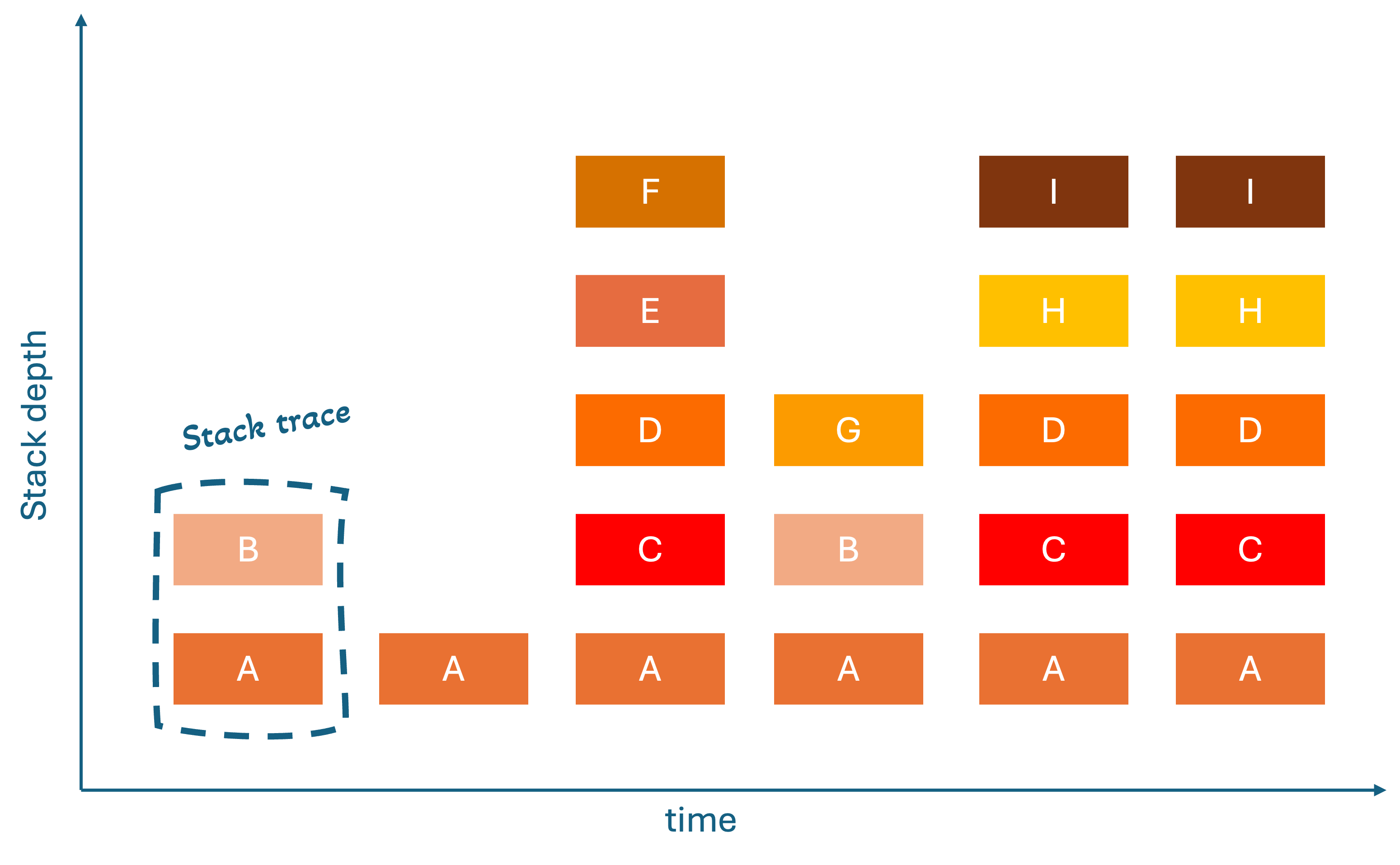
Think of it like this: when you call a function, that function might call another function, which calls yet another function. A stack trace captures this entire chain, showing you the complete path from your main program down to the deepest function call. Tools used to gather the stack traces during a period of time, actually makes a snapshot with a certain frequency. For pprof, which we will use later in the example project, this is 100hz [2, 3]. This means below show the stack traces of a program for 60ms (6 stacks times snapshot every 10ms).
The Evolution: From Stack Traces to Flame Graphs
Brendan Gregg's journey to creating flame graphs started with a fundamental problem: raw stack traces were incredibly difficult to analyze when you had thousands of them. The traditional approach of looking at text-based stack traces was like trying to understand a complex system by reading individual sentences scattered across thousands of pages [4].
The First Breakthrough: Flame Charts
The first innovation was flame charts, which showed stack traces over time. The x-axis represents chronological time, and the y-axis shows stack depth. Although this can help with identifying temporal patterns and loops, they are hard to read because they show too much temporal detail that often obscure real performance patterns and don’t work with multithreading (concurrent execution of tasks within programs).
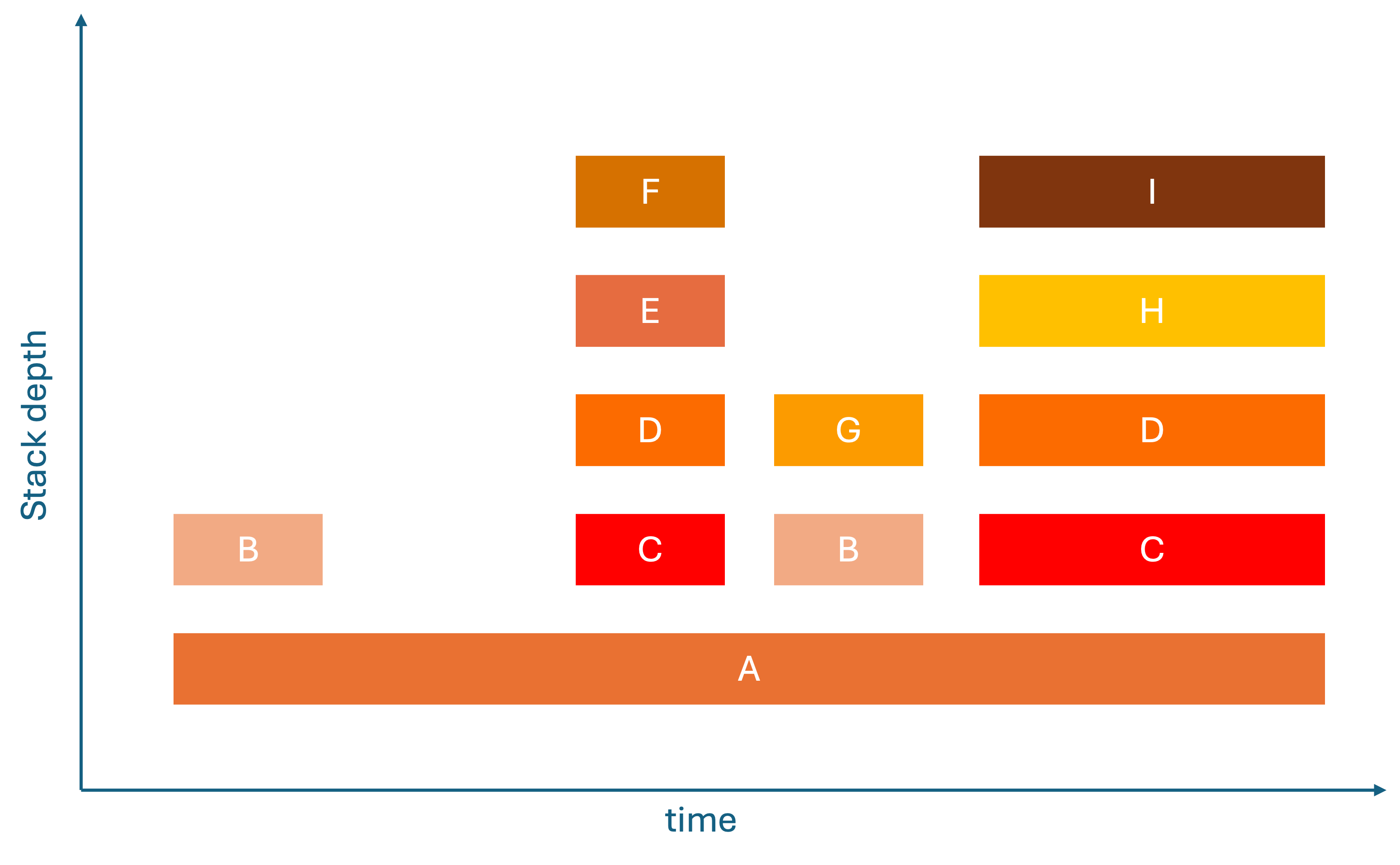
The Revolutionary Solution: Flame Graphs
The breakthrough came when with the realization, you don't need to know when functions were called – you need to know how often and long they are called. This insight led to flame graphs [5], where:
- Horizontal axis (X): Total time spent in a function (width = CPU cost).
- Vertical axis (Y): Call stack depth. Each row is a different level in the stack trace.
- Colors: Arbitrary. They are used to make functions distinguishable or make explicit which language is used.
This transformation made performance analysis intuitive because the widest bar immediately show you where your code is spending most of its CPU time.
How to Read a Flame Graph
Understanding flame graphs is surprisingly straightforward once you know what to look for:
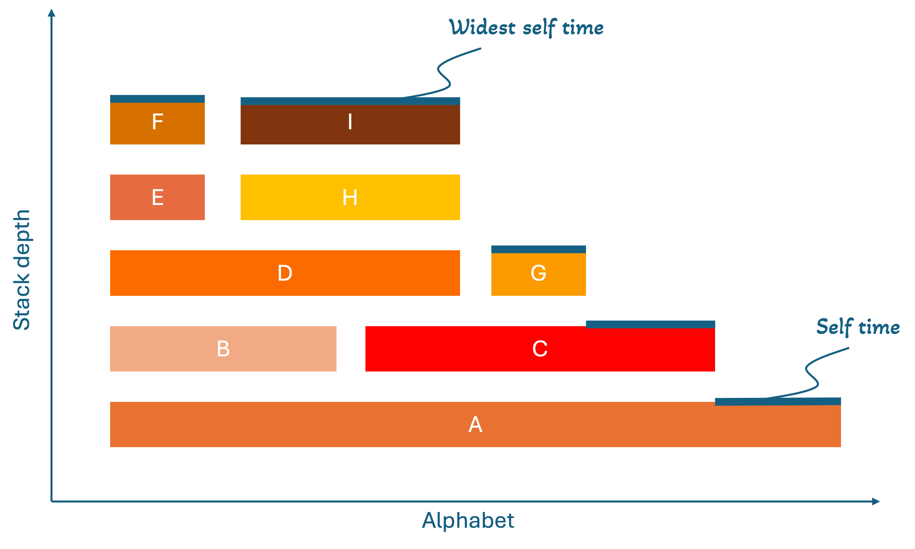
Basic Structure
Each bar (called a "frame") represents a function call. The width of each frame shows the total time that function spent executing, including time spent in functions it calls. The height shows the call stack depth, where functions at the bottom called the functions above them.
What to Look For
- Wide frames = Functions that consume the most total time (prime optimization candidates)
- Self time = The difference between a frame's width and the frames directly below it (shows time spent in that specific function, not its children)
- Tall stacks = Deep call chains that might be worth investigating
How to Optimize CPU Usage with Flame Graphs
When optimizing CPU usage, start by looking for the widest frames, which represent the functions consuming the most CPU time. Focus on functions with high "self time", as these are doing actual work rather than just calling other functions.
Analyze the call stacks to identify deep call chains, loops, or recursive patterns that might be inefficient, and look for functions that appear multiple times across the graph indicating frequent calls. Once you've identified these hotspots, apply targeted optimizations like algorithm improvements, caching frequently computed results, loop optimization, or using more efficient data structures.
After each optimization, re-run the profiling to measure the impact and see if the frames have become narrower. Continue this process until you've addressed the major bottlenecks. The beauty of flame graphs is that they make it immediately obvious where to focus your optimization efforts for maximum performance gains.
How to Generate a Flamegraph (Step-by-Step Tutorial)
Let's walk through creating a simple Go application and generating a flame graph to see CPU performance in action.
Prerequisites
- Docker
- IDE (VS Code)
- Go (optional, for local development)
Step 1: Create the Go Application
First, let's create a simple Go application that we can profile:
go.mod:
module example.com/go-flame-fib

go 1.22.0
main.go:
package main

import (
	"fmt"
	"log"
	"net/http"
	_ "net/http/pprof" // enables /debug/pprof
	"strconv"
	"time"
)

// Inefficient: Growing slice by appending one by one
func inefficientSlice(n int) []int {
	slice := make([]int, 0)
	for i := 0; i < n; i++ {
		slice = append(slice, i) // May cause multiple reallocations
	}
	return slice
}

// Efficient: Pre-allocate with known capacity
func efficientSlice(n int) []int {
	slice := make([]int, 0, n) // Pre-allocate capacity
	for i := 0; i < n; i++ {
		slice = append(slice, i)
	}
	return slice
}

func handleInefficient(w http.ResponseWriter, r *http.Request) {
	const n = 10000
	seconds := parseSeconds(r, 10)
	start := time.Now()
	deadline := start.Add(time.Duration(seconds) * time.Second)
	iterations := 0
	var result []int
	for time.Now().Before(deadline) {
		result = inefficientSlice(n)
		iterations++
	}
}

func handleEfficient(w http.ResponseWriter, r *http.Request) {
	const n = 10000
	seconds := parseSeconds(r, 10)
	start := time.Now()
	deadline := start.Add(time.Duration(seconds) * time.Second)
	iterations := 0
	var result []int
	for time.Now().Before(deadline) {
		result = efficientSlice(n)
		iterations++
	}
}

func parseSeconds(r *http.Request, def int) int {
	q := r.URL.Query().Get("seconds")
	if q == "" {
		return def
	}
	s, err := strconv.Atoi(q)
	if err != nil || s <= 0 {
		return def
	}
	return s
}

func main() {
	http.HandleFunc("/inefficient", handleInefficient)
	http.HandleFunc("/efficient", handleEfficient)

	log.Println("listening on :8080 (pprof at /debug/pprof/)")
	log.Fatal(http.ListenAndServe(":8080", nil))
}
Step 2: Create Dockerfile
Dockerfile:
# build stage
FROM golang:1.22-alpine AS build
WORKDIR /app

# use module cache for faster builds
COPY go.mod ./
RUN go mod download

COPY . .
RUN go build -ldflags="-s -w" -o server .

# slim runtime
FROM gcr.io/distroless/base-debian12
EXPOSE 8080
ENV GOMAXPROCS=1
COPY --from=build /app/server /server
USER 65532:65532
ENTRYPOINT ["/server"]
Step 3: Create Deployment Script
deploytest.sh:
# Test efficient slice operations
echo "Starting efficient slice load..."
curl "localhost:8080/efficient?seconds=30" &
echo "Profiling efficient slice load..."
go tool pprof -proto -output=./cpu.efficient.pb.gz "http://localhost:8080/debug/pprof/profile?seconds=30"

# Test inefficient slice operations
echo "Starting inefficient slice load..."
curl "localhost:8080/inefficient?seconds=30" &
echo "Profiling inefficient slice load..."
go tool pprof -proto -output=./cpu.inefficient.pb.gz "http://localhost:8080/debug/pprof/profile?seconds=30"

# Build the server binary for symbolization
go build -o server .

# Convert to folded format, then to SVG
go tool pprof -raw ./server cpu.efficient.pb.gz | perl FlameGraph/stackcollapse-go.pl > cpu.efficient.folded
perl FlameGraph/flamegraph.pl --width 1400 --countname=samples cpu.efficient.folded > cpu.efficient.svg

go tool pprof -raw ./server cpu.inefficient.pb.gz | perl FlameGraph/stackcollapse-go.pl > cpu.inefficient.folded
perl FlameGraph/flamegraph.pl --width 1400 --countname=samples cpu.inefficient.folded > cpu.inefficient.svg
We use the FlameGraph toolchain for visualization and stack collapsing [2], and the Go pprof tooling to collect and transform profiles [4].
Step 4: Generate the Flame Graph
Make sure Docker is running
-
Start the application:
docker build -t go-flame-fib . docker run --rm -p 8080:8080 -e GOMAXPROCS=1 go-flame-fib -
Generate load (in another terminal):
chmod +x deployTest.sh
./deployTest.sh
Results
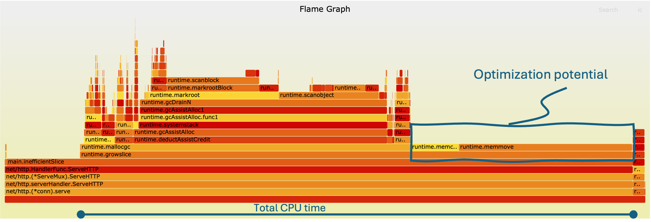
To put theory into practice, we profiled two versions of our Go application: one using an inefficient slice allocation strategy and another using an optimized pre-allocated slice. The flame graphs generated from these runs reveal stark differences in CPU behavior.
Inefficient Slice Allocation
The flame graph for the inefficient implementation shows wider frames concentrated around append, a clear sign that repeated reallocation dominates CPU time. Sometimes it can be difficult to pinpoint the stack traces to the individual code, luckily this is something AI (like ChatGPT) can help with. In this case the runtime.mem… can be related to the append function. Each iteration forces the runtime to grow the slice dynamically, causing expensive memory copying and reallocation. As a result, most of the CPU cycles are wasted on overhead rather than actual work.
Visually, this manifests as broad horizontal blocks tied to the slice growth operations, highlighting them as prime optimization candidates. The stack depth is also slightly inflated, reflecting additional runtime management overhead introduced by repeated reallocations.
Efficient Slice Allocation
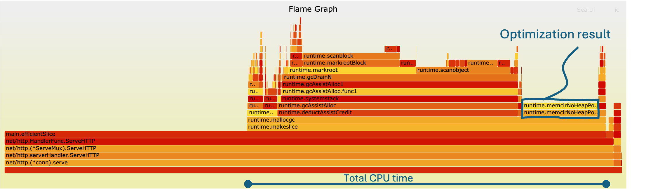
In contrast, the optimized version, where the slice capacity is pre-allocated, produces a much leaner flame graph. The wide frames around append nearly disappear, replaced by slimmer, more evenly distributed frames. Here, the CPU spends its time executing actual logic rather than housekeeping tasks, clearly seen as smaller and stacked runtime.mem functions.
The overall graph appears taller but narrower, indicating deeper call chains but far fewer wasted cycles on reallocation. This confirms that a small code change, pre-allocating memory, reduces CPU time with 32%.
Key Takeaways
- Widest frames = biggest bottlenecks: In the inefficient version, append reallocations dominated, making it the obvious optimization target.
- Memory management overhead: Inefficient allocation patterns stack runtime memory operations on the graph, inflating CPU usage.
- Optimization impact: With pre-allocation, CPU cycles are reclaimed for useful work, leading to a more efficient execution.
This experiment demonstrates the real power of flame graphs: with a quick glance, they reveal not just where time is being spent, but why. Even a simple workload like slice building produces a dramatically different profile depending on allocation strategy, and flame graphs make those differences impossible to miss. These insights matter not only for performance tuning but also for teams looking to optimize infrastructure usage and adopt flame graphs as part of a cloud cost optimization strategy.
Conclusion
Flame graphs unlock a remarkably intuitive way to understand how your application uses CPU time. Instead of wading through raw stack traces, the visualization highlights hotspots visually, making obvious where optimizations will yield the biggest impact. Our example with inefficient versus pre-allocated slices showed this clearly: one small change transformed the flame graph, shedding width in wasteful routines and shifting cycles into useful work.
If you want to take flame graphs further, particularly in containerized environments, check out our website benchtest.dev. The site offers automated workflows to build flame graphs and much more profiling data for containers, letting you incorporate performance analysis into your CI/CD pipelines with ease.
Thanks to flame graphs, performance tuning becomes a guided, feedback-driven process. You can identify, fix, re-profile, and immediately see whether your interventions helped. Over time, these visual insights will sharpen your instincts about performance, letting you ship faster and more efficiently.
References
- Brendan Gregg. Flame Graphs. https://www.brendangregg.com/FlameGraphs
- Go runtime package documentation. https://pkg.go.dev/runtime/pprof
- Go runtime package codebase. https://go.dev/src/runtime/pprof/pprof.go?s=10406%3A10461
- Visualizing Performance - The Developers’ Guide to Flame Graphs • Brendan Gregg • YOW! 2022. https://www.youtube.com/watch?v=VMpTU15rIZY&t=623s
- Brendan Gregg. FlameGraph (GitHub). https://github.com/brendangregg/FlameGraph
Ready to optimize your container performance?
Start profiling your containers with performance insights. No credit card required.